BLOG
Sound and Completion 2021/09/24
The last thing I needed to add was sound. Because this is based on weird little experimental games, my goal with the sound design was to have some fun with it and be silly. I have the dance music that gets cut off into an explosion, or the goofy fishing rod reel sound effect.
Overall, I quite like the end result. It isn’t sophisticated but that was never the point. It’s a cute project that was fun to make. I like the way I played with space, having some shots with a very low FOV to make the camera look almost orthographic, and then pulling it out and rotating it all in 3D space.
Almost Finished2021/09/20
I treated this project almost like a game jam. For the scripting especially, it was not important that my solutions were elegant or readable, I just wanted to have them done. Things like hard-coding and boilerplate which I would normally avoid I am fine adding here. The only issue with this philosophy is that my GameManager class is a complete mess, and if I wanted to expand this project I would need to completely refactor everything. I’m using a Finite State Machine to control the game, so that each different camera position is its own state. ie. “Tap Turn On State”, “Fishing Rod State”. This way I can have simple transitions in and out to change things like camera position. I’m also using Cinemachine for the first time, which is something I’ve always been scared to use but I found it very intuitive.
Sketch2021/09/18
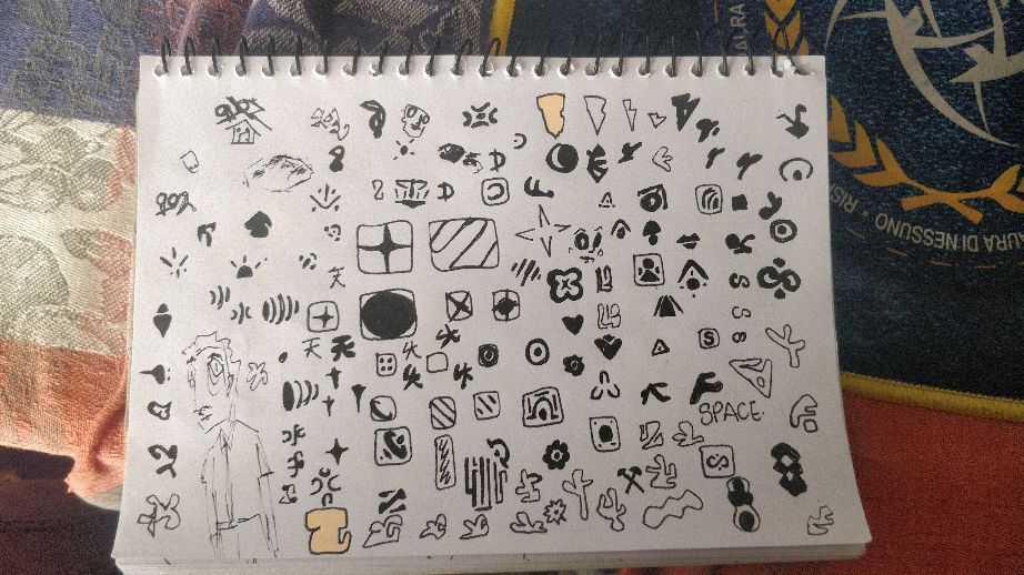
Here is my initial “word sketch”. It’s just any idea that I think would be funny to implement. I don’t expect to add all these ideas but I think a lot of them should be in there. I’ve started making something things in blender and importing them as FBX files into Unity.
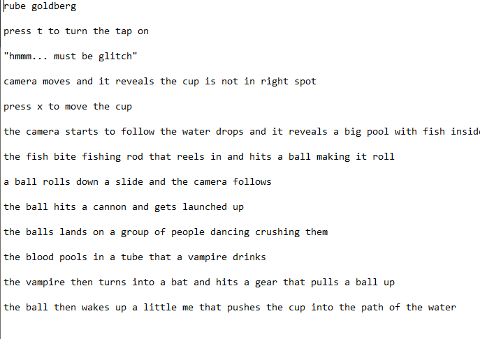
What is a rube goldberg machine2021/09/17
I think in its simplest form, a rube goldberg machine is something that does a simple task, but in the most inefficient and awkward way possible. It exists because someone thinks its funny or interesting, not because there’s any practical reason for its existence. It’s a kind of toy, essentially. Looking on youtube, they are mostly made from household objects and things the creator would have lying around. With that in mind, I want to carry that philosophy of simplicity into my machine.
The other inspiration I had in mind was that of quirky Japanese video games. Games like Katamari Damacy, the Warioware franchise, rhythm heaven. Anything that is bright, colourful, weird, but also somehow quite minimal. A lot of those games have very simple flat coloured graphics which is something I want to emulate.
Thankfully I have plenty of experience with Unity and C# so I will be fine to do some more advanced things with the scripting.
Colour2021/08/27
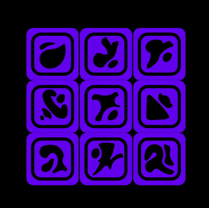
Here’s the finished product. I had to go minimal with the colours for technical reasons, but I like the cohesion. The sound turned out really well I think. Each feels just like splashing in water, or a slightly digital blip. I think it fits well with the abstraction of each shape. All in all, I think I did well to create a unique approach to flat design.
Colour2021/08/26
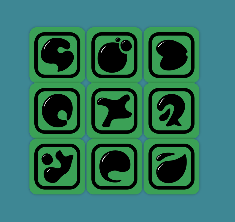
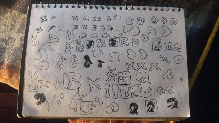
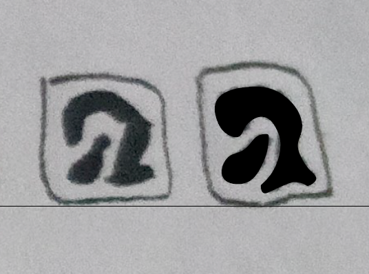
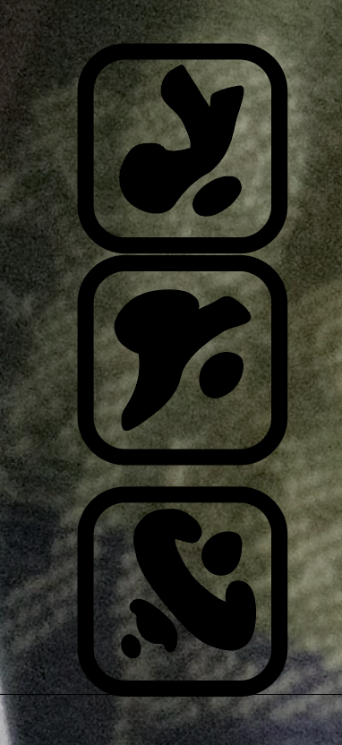
I’ve now finished all the icons. They are abstractions of sea life. From left to right they represent a fish coming out of water, a drop of water, a swimming fish, a piece of driftwood, a swirling wave, bubbles, a sunfish, a shell, and a starfish.
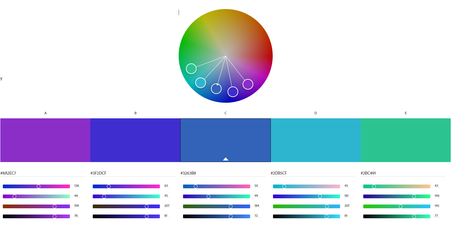
Colour has not been something I’ve thought too much about. I knew I wanted to keep it minimal, but with the space theme I had the idea of just using black and a solid colour. The desolateness and the blackness of space lending itself to this minimalism I think. But as I am now doing sea life, I can be a bit more free with colour expression. The classic sea world imagery is blue background with coral reef reds and oranges. Alternatively I could make a beach inspired theme with pastels and washed out desaturated yellows and blues. I think something more saturated fits flat design better, and I think an analogous palette would work well. Blue should be the base, but I think stretching my legs out into purples and greens could look really nice.
Revision2021/08/25
Looking at my ideas about using sound and shape for personality, I’ve come to realise that space isn’t the best theme, mainly because it is so vast and empty. I’ve decided to change to doing sea life, as I feel like animals and the perfect candidate to inject with personality. I also think I need to tone down the abstractness of the forms, because it is becoming evident that it is difficult to differentiate each icon as they just look like blobs. I think there is a lot of crossover between space and the ocean, the unknown, the emptiness, the vastness. For the sound, I’m going to implement a low pass filter on a lot of the noises so they feel like they are underwater.
Sound and website2021/08/23
Although I have some experience in html and javascript, I found this webpage incredibly frustrating to create. I think I potentially bit off more than I could chew. I really wanted to emulate Google’s Material Design ripple effect, and I tried using Google’s code to create it. I do not have enough experience however to properly implement all the infrastructure around it. I did try using npm and scss but it was incredibly foreign to me, and I probably wasted too much time doing it. A lesson for next time. I used a free tutorial instead to implement the ripple and removed the gradients to make the design flatter. I also kept the drop shadow effect. Although it does look less “flat”, I think it helps ground each element and keep them feeling cohesive. For sound I used FL Studio. I have a lot of sounds from my personal sample library that I thought would work quite well. I wanted to pick sounds with a loud transient so when the user clicks on a button there is an instantaneous noise with no build up. Things that clicked or popped I thought worked quite well. I also used a reverb filter and a room effect to make the sounds feel like they were in an empty room. I wanted it to be echoey because it matched the emptiness of space.
Mood board2021/08/21
I’ve linked my graphic design pinterest board here. There are a lot of ooey gooey globular organic shapes and designs recently as I try to look for inspiration in this assignment. https://www.pinterest.com.au/adamdinhvu/logove/
Illustrator revision2021/08/20
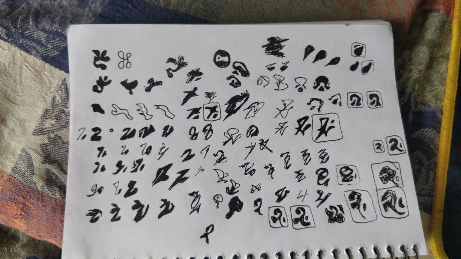
I’ve started digitising some of the icons in illustrator and I think it’s going quite well. Hopefully I will have 9 icons finished soon. I’ve tried to have my icons have this diagonal directionality in attempt to create a unified design. I’m having trouble however coming up with 9 icons that are all organically shaped, spaced themed, and pointing in a downward diagonal. I may have to broaden my constraints a little. They say limitation breeds creativity but this might be going too far.
“Flat Design”2021/08/19
Flat design has come into prominence in the world of UI design for web and mobile. The simple shapes, legible lines and minimal details all equate to very readable iconography. Texture, colour, value and form are all incredibly minimal. I think Google’s Material Design is the best implementation of flat design out of any company. The use of bright colours and this very unified design language is incredibly useful for website and app developers, and I always find Google’s software (aside from some privacy complaints) a joy to use. A big part of this design is trying not to emulate real world design, that is skeuomorphic design. Rather than a button being pressed down, Google will have a button ripple out. It’s quite subtle but it makes a difference I think.
Sketches and ideas2021/08/16
I chose the theme of space for this assignment because I think it gives me a lot of freedom. Space is incredibly vast and empty and because of that humanity injects it with a lot of our own ideas and mythology. I feel like there is a lot of interesting imagery I can pull from for this icon set. I want to use a lot of organic shapes to unify the icon set. That is antithetical to the geometric shapes normally associated with flat design, but I feel like one advantage that using organic shapes is the personality it allows. I want to give each icon a unique sound, and maybe colour, so I feel like making them all feel like a character will help me create something very visually interesting.
I should also attempt to use the element of space effectively, making sure each icon is quite small, relative to its surroundings. This way it feels empty, mimicking the vastness of space. I also wanted to emulate the nature of orbiting planets, by having some multiple shapes of differing sizes.
My sketches so far are completely random. I’m just trying to find shapes and arrangements that feel vaguely space themed. Mostly just scribbles that I think look like they have movement and rhythm to them, like a spaceship or a speeding comet.
Black Squares Reflection2021/08/12
After reading through Rob Roy Kelly's analysis and instructions, I found that a lot of the ideas I had are put into words. I think especially what the examples that Kelly used for tension particularly enlightening. How he had organized two shapes so that they were either part of the same object, two completely different objects or somewhere in between. That inbetween state had the most tension, as it is ambiguous whether of not the objects are meant to be together or apart. I think ambiguity is such an interesting way to describe tension. Its like how seeing a guy running at you with a knife is scary, but its not tense, whereas not being sure if someone walking towards you is going to stab you or not, that is tense.
Assignment 1 Submission 2021/08/09
https://vimeo.com/583807478
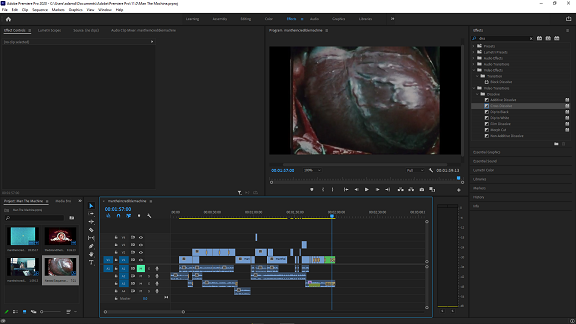
After watching the Dot and the Line, I was left feeling like the story it tells is quite unrealistic. I understand that it is a cartoon about a line and a circle but the idea that you can get someone to fall in love with you and leave their current partner felt a bit like the stuff that comes out of incel forums. I took that idea and decided to work with it. I wanted to turn a cute love story into the story of a man being creepy toward a woman and then getting rightfully rejected. The footage from 'Man the Incredible Machine' had some suitabully gross imagery that I could draw from. I wanted to edit to new music originally but the orchestration from the actual cartoon worked really quite well. A lot of the big hits and swells synced up very easily with the footage, probably because of its exaggerated and cartoony origins. I had some difficulty getting everything to line up and I had to chop up the audio in some places to swap out words and sentences. I think it is a little noticeable, but I don't think it's all that distracting.
Overall, the story I created came through, although I wouldn't say it is entirely obvious. I think a lot of the intimate close ups add to this sense of perversion, especially since they can be seen as a kind of point of view shot. The final montage is also pretty nice, as it fades out with a host of sporadic imagery. I switched from smash cuts to fades as it progresses, as if the main character is starting to space out after realising he 'didn't get the girl.' Incel-types can often put an exaggerated amount of self esteem into sexual relationships, so I thought this ending was appropriate.
The main technique I used was cutting to the beat. This was aided by the use of repeated video phrases. Clips would often be rhythmically in time with the music, and as such be the exact same length, like at the section starting at 0:58. I also tried to edit with the natural rhythm of the narrator. I think this greatly improved pacing.
Assignment 1 Feedback 2021/08/05
I received my first piece of criticism for an assignment at RMIT and everyone was very kind to me. I can be very nervous in sharing work, although I've gotten a lot more confident in recent years. Most people agreed that there was some form of plot but I think they agreed with me that the predatory nature of the main character did not come through. This makes me think I should either completely rip out that aspect of it, or reinforce it. I think reinforcing it is infinitely more interesting because it means a story with more nuance and conflict. Although it is only two minutes, I do think it is possible to create a story like that. I don't want to ruin what I have however because it is solid. I'll probably try to add some music or sound effects. That way I can utilise every tool in my collection.
Assignment 1 First Draft 2021/07/23
This is the completed first draft. I tried uploading it to youtube but it got taken down for having nudity. I tried to create a story with the clips and voiceover which proved to be incredily difficult, especially because the story is not the one told by the clip I used as voice over. 'The Dot and the Line' is a love story, but I wanted to turn it into a story about someone being predatory and creepy. It doesn't quite translate to my final video, in fact I'm not sure if it translates at all. I tried to used the close up shots from the medical for a sense of intimacy and perversion. I think in the first section it works quite well, but after that it falls through. I also never did the quick cut editing that I wanted to. I instead edited to the music which worked well. Although I was limited in what I could do. i would find that clips would often be too short so the transition between was awkward, but it worked out well enough. I also used a lowpass filter in the final section, which was in an attempt to show that the predator character was spacing out after getting told off. It doesn't come through at all, but the effect is quite nice. Overall, it worked pretty well. I have some experience editing to music from a music video I made a few months ago, so this wasn't too difficult.
Assignment 1: Video Editing Basics 2021/07/19
It's been a while since I last used this blog. This is going to be my Uni Journal / Homework and assignment blog space. It's just raw html, no the prettiest or most efficient but its... charming.
So first assignment. Basically a tutorial / introduction for Premiere. I've got a good bit of experience with video editing, but for this assignment I'm only allowed to use cutting, fading, eq, etc. The basic functions. Limitation breeds creativity and all that, so this should be fun.
I've been given some public domain archival footage to edit into something new. I think I'm gravitating toward the nat geo medical educational video. I love everything old and outdated, and the analogue warmth and crackle coming through the audio makes me smile. But I'm thinking about making something gross. When I only have cutting, I want to take it to its extreme. Constant epilepsy-triggering cutting, maybe set to music. It's one of my favourite effects. Out of the two voiceovers I have to edit together neither really fit this bill exactly so I'm going to need to change a few things around. Something glitchy, freaky, dark, but without changing any of the contents, just flipping it around.